Macmillan Cancer Support
Typography Approach
Typography, Branding, Illustration
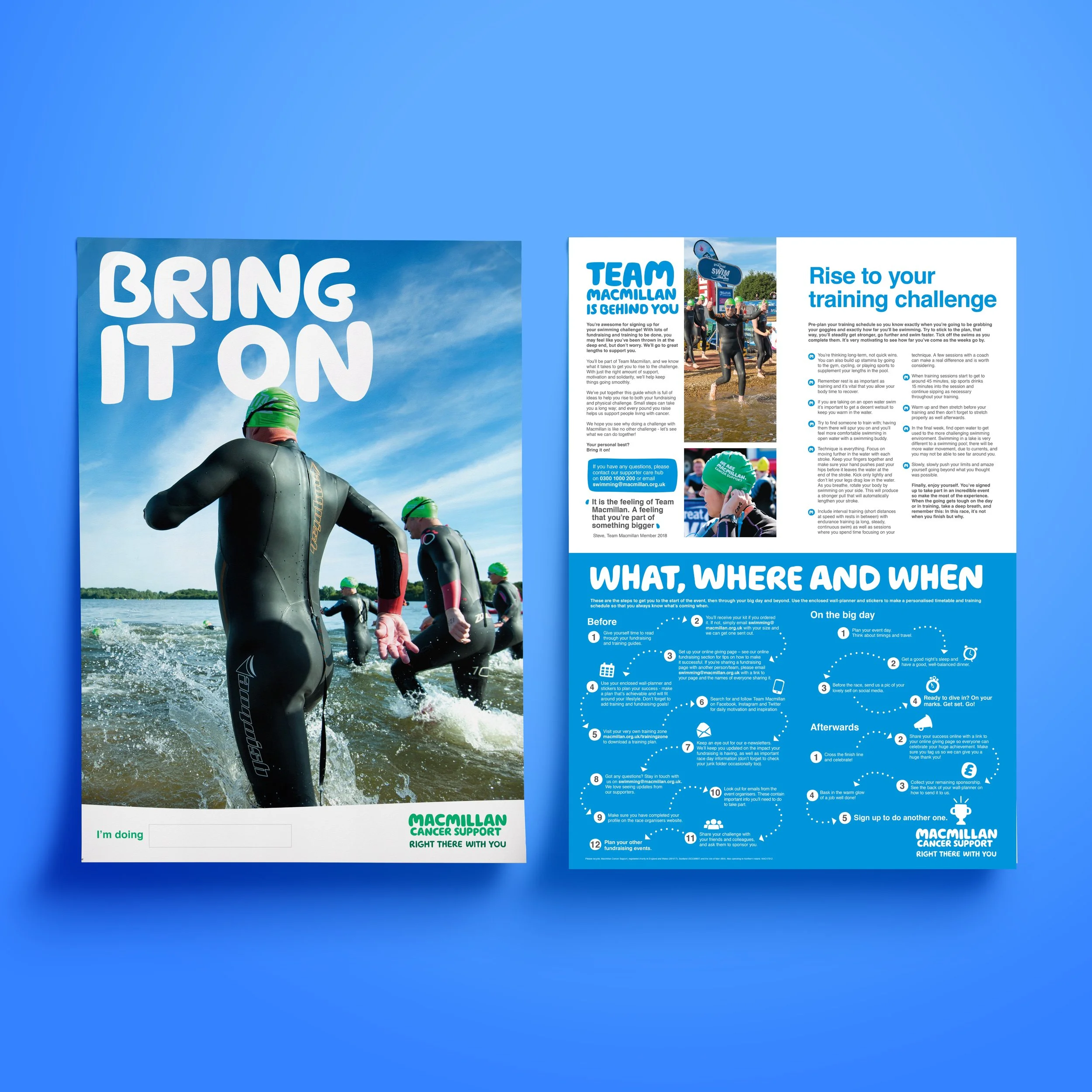
As part of Macmillan’s brand refresh, I was asked to rethink the approach to typography. The challenge was to create something bold and contemporary that aligned with the new strategic direction, while still feeling familiar and rooted in the brand’s history of clear, supportive communication.
I positioned the headline typeface as a central, comforting presence, allowing it to be large within layouts in a way that visually reinforces Macmillan’s new brand message: we’re always here for you. By using type at scale, the designs became both bold and empathetic, creating an immediate sense of support and reassurance.
This approach gave the brand a modern, confident voice while retaining a clear link to its legacy as a source of vital information. The result is a typographic style that feels both fresh and authentically Macmillan.