Moneybox
Illustration style
Campaign, Branding, Illustration
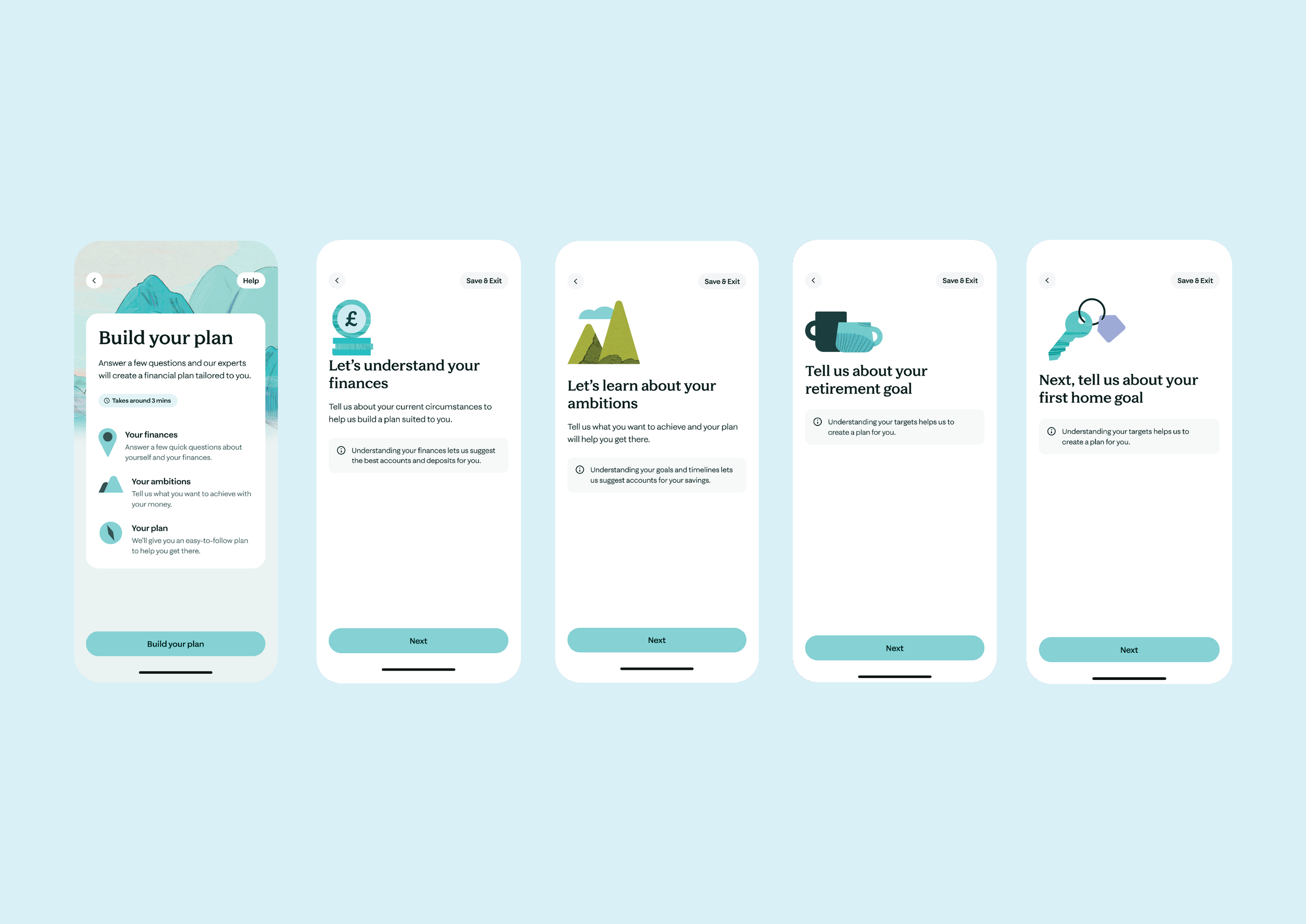
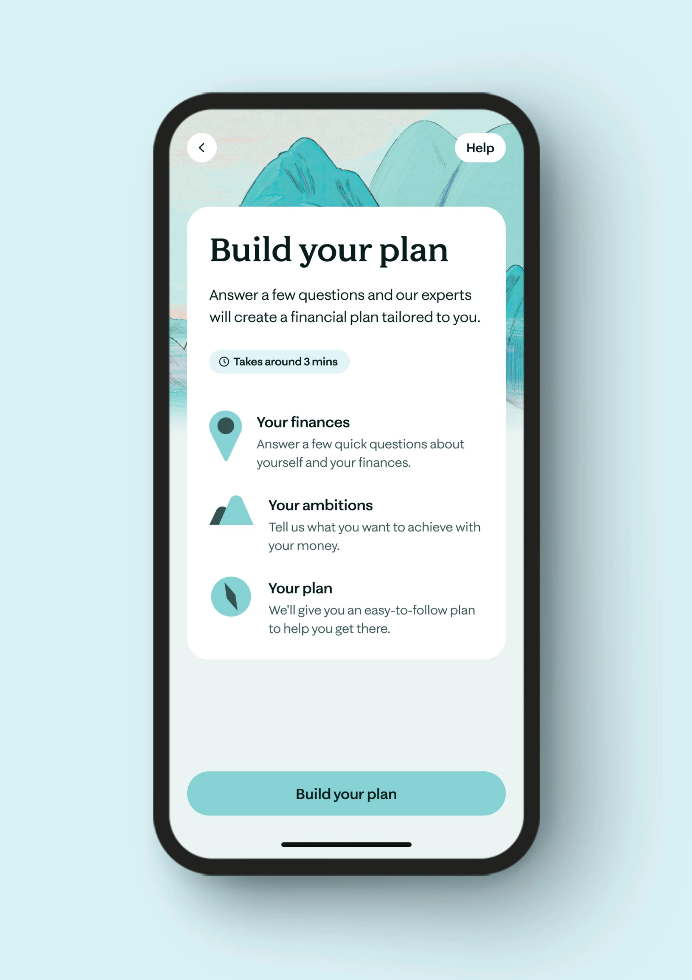
After the rebrand, we needed to update the icon and illustration system to align with the new visual identity. However, the refreshed style leaned too abstract, which made it less accessible across a broad demographic. My role was to refine the approach by developing a more literal and universally understandable visual language, ensuring clarity, consistency, and immediate recognition across a wide range of audiences and use cases.
My approach was to deconstruct the rebranded icons and redraw them to communicate a broader range of information more clearly. I used the previous icon system as a foundation, then incorporated the updated textures and stylistic elements from the rebrand. This resulted in a hybrid visual language that felt more literal, informative, and accessible, while still aligning seamlessly with the refreshed brand identity.
The solution proved successful, improving clarity across diverse audiences, and the icon system remains in use today as a core part of the brand’s visual toolkit.